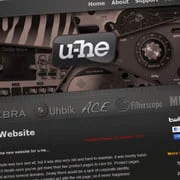
Urs Heckmann of u-he has announced its new website, which is scheduled to launch this June.
The old website was nice and all, but it was also very old and hard to maintain. It was mostly hand-coded, which bloats once you’ve got more than two product pages to care for. Product pages were spread across several domains. Slowly there would be a lack of corporate identity. Embracing the new u-he logo was a painful act with the old page, so it never happened.
Now we have a real content management system, we have a consolidated website with all products and services in one single spot. Each product has its own page, with condensed information, better presentation, fresh media content and everything.
Also, we’re taking the interactive path with our customer support tool, newsletter via MailChimp, social network services like Twitter and Facebook – hopefully improved service in general…
I think it’s gonna be good.
More information: u-he
 Save big with Plugin Boutique's Mixing Month Sale!

